Risk Reduction Calculator
Understanding Risk Reduction
The FDA requires absolute risk numbers on drug labels to help patients make informed decisions. This calculator helps you convert relative risk reductions into absolute risk reductions to better understand what a treatment really means for your health.
Risk Reduction Results
Absolute Risk Reduction
0%
This is the actual difference in risk between treatment and control groups. This is what matters for your individual benefit.
Relative Risk Reduction
0%
This shows how much the treatment reduced the risk compared to the control group. It often makes benefits seem larger than they are.
The visual comparison shows the actual difference in risk. For example, a 4 percentage point reduction (4%) might look dramatic as a 38% relative reduction, but it means 4 fewer deaths out of 100 patients.
Why This Matters
When a label says "reduced risk by 38%" but doesn't show the absolute numbers, ask your doctor for the baseline risk and absolute risk reduction. This helps you understand the real benefit of the treatment for you.
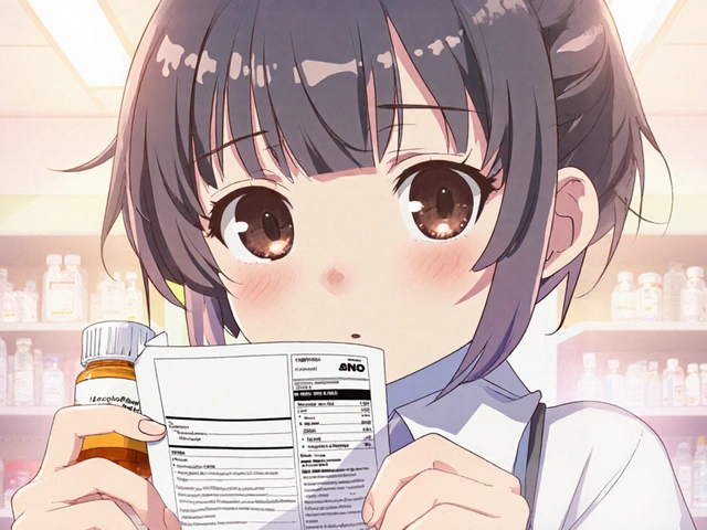
When you pick up a prescription bottle or read an online drug fact sheet, you’ll see a block of text that tries to balance what the medicine can do for you against what it might do to you. Those are the risk-benefit statements that the U.S. Food and Drug Administration (FDA) requires on every approved label. For many patients the jargon feels like a legal wall, but cracking it open can actually help you decide whether a drug fits your health goals.
Key Takeaways
- Risk‑benefit statements live in specific label sections (Contraindications, Adverse Reactions, Use in Specific Populations, Clinical Studies).
- The FDA builds these statements using the Benefit‑Risk Framework, a structured matrix that weighs clinical benefits against safety risks.
- Look for absolute numbers (e.g., 6.5% vs 10.5% mortality) instead of relative percentages, which can exaggerate perception.
- Visual aids - icons, charts, or 6th‑grade reading summaries - are becoming mandatory for many new drugs.
- Future FDA rules will push more standardized, patient‑friendly summaries, so staying current on label updates matters.
Where Do Risk‑Benefit Statements Appear?
FDA regulations (21 CFR 314.50(c)(5)(viii)) dictate that the integrated summary of benefits and risks must be embedded in the label. In practice you’ll find the narrative split across four main sections:
- Section 5 - Contraindications: Highlights groups who should never take the drug, often because the risk outweighs any potential benefit.
- Section 6 - Adverse Reactions: Lists common and serious side effects, sometimes with incidence rates.
- Section 8 - Use in Specific Populations: Explains how benefits and risks differ for children, pregnant women, or the elderly.
- Section 14 - Clinical Studies: Summarizes the pivotal trial data, including the “why the benefits exceed the risks” language required by the FDA.
Most labels also include a short "Highlights" paragraph at the top that distills the key points into a few sentences. That snippet is often the only part patients read, so it carries the most weight.
How the FDA Crafts the Statements
Benefit‑Risk Framework is a qualitative matrix that FDA reviewers fill out for every new drug or biologic application. The matrix has rows for therapeutic context, current treatments, anticipated benefits, identified risks, and risk‑management strategies. Columns separate the evidence from the conclusions, forcing reviewers to spell out both the data and the reasoning.
Reviewers spend 40-60 hours per application drafting the narrative, then undergo a 16‑hour communication course to learn how to translate population‑level data into patient‑friendly language. The final language must answer two questions:
- What are the most clinically important benefits?
- Why do those benefits outweigh the identified risks for the indicated population?
Because the framework is flexible, it works well for oncology drugs, where survival benefits can be expressed as “X% reduction in mortality,” but it gets trickier for psychiatric meds where benefits are more subjective.
Decoding Numbers: Absolute vs. Relative Risk
One of the biggest sources of confusion is how risk is presented. Studies show that patients often misinterpret relative risk reductions (RRR) as larger than they really are. For example, the label for Jardiance (empagliflozin) says:
"In adults with type 2 diabetes and cardiovascular disease, JARDIANCE reduced the risk of cardiovascular death by 38% (10.5% with placebo vs. 6.5% with JARDIANCE)."
Here the absolute risk reduction (ARR) is 4 percentage points (10.5 % − 6.5 %). That concrete number tells you how many fewer deaths you might expect per 100 patients treated.
When a label only gives a relative figure, ask the prescriber or pharmacist for the underlying absolute numbers. A 50% relative reduction sounds dramatic, but if the baseline risk is 0.2%, the absolute benefit is only 0.1%.
Visual Aids and the Push for Patient‑Friendly Summaries
Patients have repeatedly asked for simpler visual tools. In 2023 the FDA launched a pilot requiring six oncology sponsors to add a “Patient Benefit‑Risk Summary” written at a 6th‑grade reading level, complete with bar‑graphs and pictograms. The National Library of Medicine is testing a set of standardized icons that show a green check for benefit magnitude and a red exclamation for risk magnitude.
These visual cues are more than eye‑candy. Research by Dr. Jeff Shuren (CFRH) showed that patients who saw a simple risk‑benefit bar chart were twice as likely to correctly state the drug’s main benefit and main risk.
If a label you’re reading includes a graphic, spend a minute scanning the legends. Look for clear labels like “Benefit: 6.5% mortality” vs “Risk: 2% severe liver injury.” If the graphic is missing, you can request one from your pharmacist - many pharmacies now keep printable versions of FDA icons.
How the FDA Approach Stacks Up Against Other Regulators
While the FDA relies on a flexible, narrative‑driven framework, Europe and the UK use more quantitative methods. The table below highlights key differences.
| Regulator | Methodology | Patient Preference Input | Typical Visuals |
|---|---|---|---|
| FDA (US) | Benefit‑Risk Framework (qualitative matrix) | Patient‑Focused Drug Development submissions; optional preference studies | Icon sets, bar‑graphs, plain‑language summaries |
| EMA (EU) | PrOACT‑URL (quantitative scoring) | Formal patient preference studies required for many submissions | Benefit‑Risk plots with confidence intervals |
| MHRA (UK) | Mixed qualitative/quantitative mix, emphasizes patient‑reported outcomes | Integrated patient preference surveys mandated for new medicines | Color‑coded decision trees, risk matrices |
Understanding these differences helps you gauge why a US label might sound less numeric than a European one - it’s a conscious choice, not a flaw.
Practical Tips for Patients
- Read the Highlights first, then drill down. The short paragraph gives a snapshot; the detailed sections give context.
- Ask for absolute numbers. If you see “38% reduction,” request the baseline risk and the ARR.
- Check for visual aids. Look for icons or charts; they often summarize the most important benefit and the most serious risk.
- Bring a list of questions to your doctor. Example: “What does a 4% absolute benefit mean for someone my age?” or “How does my personal health history change the risk profile?”
- Consider your own values. If you’re willing to accept a higher risk of nausea for a modest increase in survival, note that - the label is a population average, not a personal prescription.
Looking Ahead: What’s Changing?
Several regulatory trends promise more patient‑centred labeling in the next few years:
- Standardized quantitative metrics. By 2025 the FDA aims to introduce uniform benefit‑risk scores for major therapeutic areas.
- Mandatory visual summaries. The 2023 pilot is expanding; by 2026 the agency expects at least 45% of new molecular entities to feature a patient‑friendly graphic.
- Greater reliance on patient preference studies. Breakthrough‑therapy designations will soon require documented patient input before the label is finalized.
- Integration with digital health tools. The FDA’s partnership with the National Library of Medicine will let patients pull up icon‑based summaries on mobile apps linked to the drug’s NDC code.
Staying aware of these changes means you can ask your pharmacist whether a newer version of the label includes the visual aid or updated absolute risk numbers.
Mini FAQ
Where can I find the risk‑benefit statement on a drug’s label?
Look at Sections 5 (Contraindications), 6 (Adverse Reactions), 8 (Use in Specific Populations) and 14 (Clinical Studies). The Highlights paragraph at the top also contains a condensed version.
What’s the difference between absolute and relative risk?
Absolute risk tells you how many people out of 100 (or 1,000) will experience the benefit or harm. Relative risk compares the chance in the treatment group to the chance in the control group, often making the effect look larger.
Why do some labels include graphs while others don’t?
The FDA is rolling out mandatory graphics gradually. Oncology drugs and newer breakthrough therapies are first in line, but many older labels still rely on text only.
Can I request a clearer version of a label?
Yes. Pharmacists often have printable versions with icons and plain‑language summaries. You can also call the FDA’s consumer hotline for a copy of the most recent label.
How do patient‑focused drug development (PFDD) comments affect the label?
PFDD input can lead FDA reviewers to emphasize certain benefits or risks that matter most to patients, and sometimes to add a patient‑focused summary section.
Understanding the language, numbers, and visual cues in FDA risk‑benefit statements empowers you to have a real conversation with your healthcare team. Keep an eye on upcoming label updates - the industry is moving toward clearer, more visual information, and you’ll be the first to benefit when it arrives.